
A new way to see your work: inside Birdi’s redesigned dashboard

When you’re working across multiple sites, datasets, and team members, the hardest part usually isn’t collecting data. It’s understanding what’s actually happening. What’s been processed, what’s been updated, where your team is focusing, and whether anything’s falling behind.
That’s exactly what we set out to improve with Birdi’s updated dashboard.
This isn’t just a visual refresh. It’s a shift toward a more structured, flexible workspace that helps you move from scattered activity to clear, shared insight.
.png)
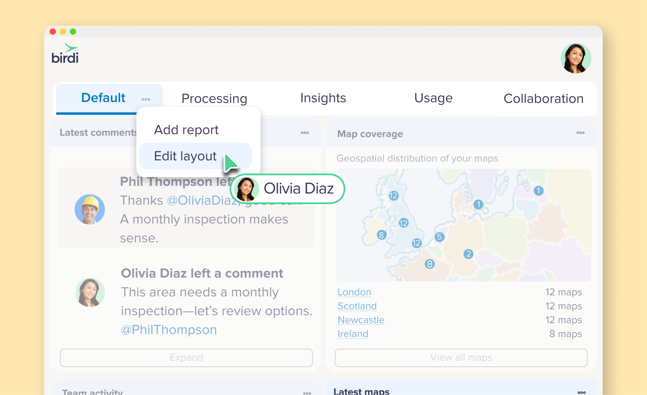
What is Birdi’s updated dashboard?
Birdi’s redesigned dashboard is a central workspace that brings together processing, insights, usage, and collaboration into one view — giving teams a clearer, more structured way to understand and act on their geospatial data.
Insights in one place
.png)
The new dashboard, powered by Map View 2.0, is built around a simple idea: different types of information shouldn’t be competing for your attention in the same space.
Instead, everything is organized into five focused tabs, each designed to answer a specific question:
- What’s happening right now?
- What’s been processed?
- What are we learning from our data?
- How are we tracking usage?
- How is the team working together?
It sounds simple, but separating these views makes it much easier to scan, understand, and act.
A dashboard that adapts to how you work
One of the biggest changes is flexibility. The Default tab is no longer a fixed view. It’s now a fully customizable workspace that you can shape around your role, your projects, or even your team. You can bring in widgets that matter to you — whether that’s processing activity, map updates, or usage trends — and arrange them in a way that makes sense.
For someone managing operations, that might mean keeping a close eye on processing and usage. For someone reviewing outputs, it might be all about maps, detections, and comments.
And because this is set per workspace, different teams can structure things differently without stepping on each other’s toes.
Better visibility into processing and outputs
Processing has always been a core part of Birdi, but visibility into it hasn’t always been as clear as it could be. That’s changed.
With dedicated processing reports, you can now see:
- What’s currently being processed
- What’s been completed
- Where things might be slowing down
And importantly, this spans across outputs like orthomosaics, DEMs, point clouds, and AI detections. It’s a small shift, but it means fewer surprises and more confidence that things are moving as expected.
Turning maps into insights (not just outputs)
The Insights tab is where things start to feel different.
Instead of just listing maps, it brings together activity across your workspace:
- Newly created or updated maps
- AI detections
- Coverage across different locations
- Team comments and interactions
This is where geospatial data starts to become something you can actually act on. You’re not just looking at outputs, you’re understanding what’s changing, where, and why it matters.
Keeping usage and growth in check
If you’re managing a team or scaling up projects, usage visibility becomes important pretty quickly.
The new Usage tab gives you a much clearer picture of:
- Storage and processing consumption
- Workspace and seat allocation
- Guest collaboration
- Upload and activity trends
With seven new reports added, it’s easier to stay ahead of capacity instead of reacting to it later.
Making collaboration more visible
One of the more subtle (but important) updates is around collaboration. Work doesn’t just happen in maps — it happens in conversations, edits, and shared outputs.
The Collaboration tab brings that into view:
- Who’s uploaded data
- What’s been processed or shared
- Where comments and mentions are happening
It gives you context around the work, not just the outputs. And that’s often what helps teams stay aligned.
Built on a growing library of widgets
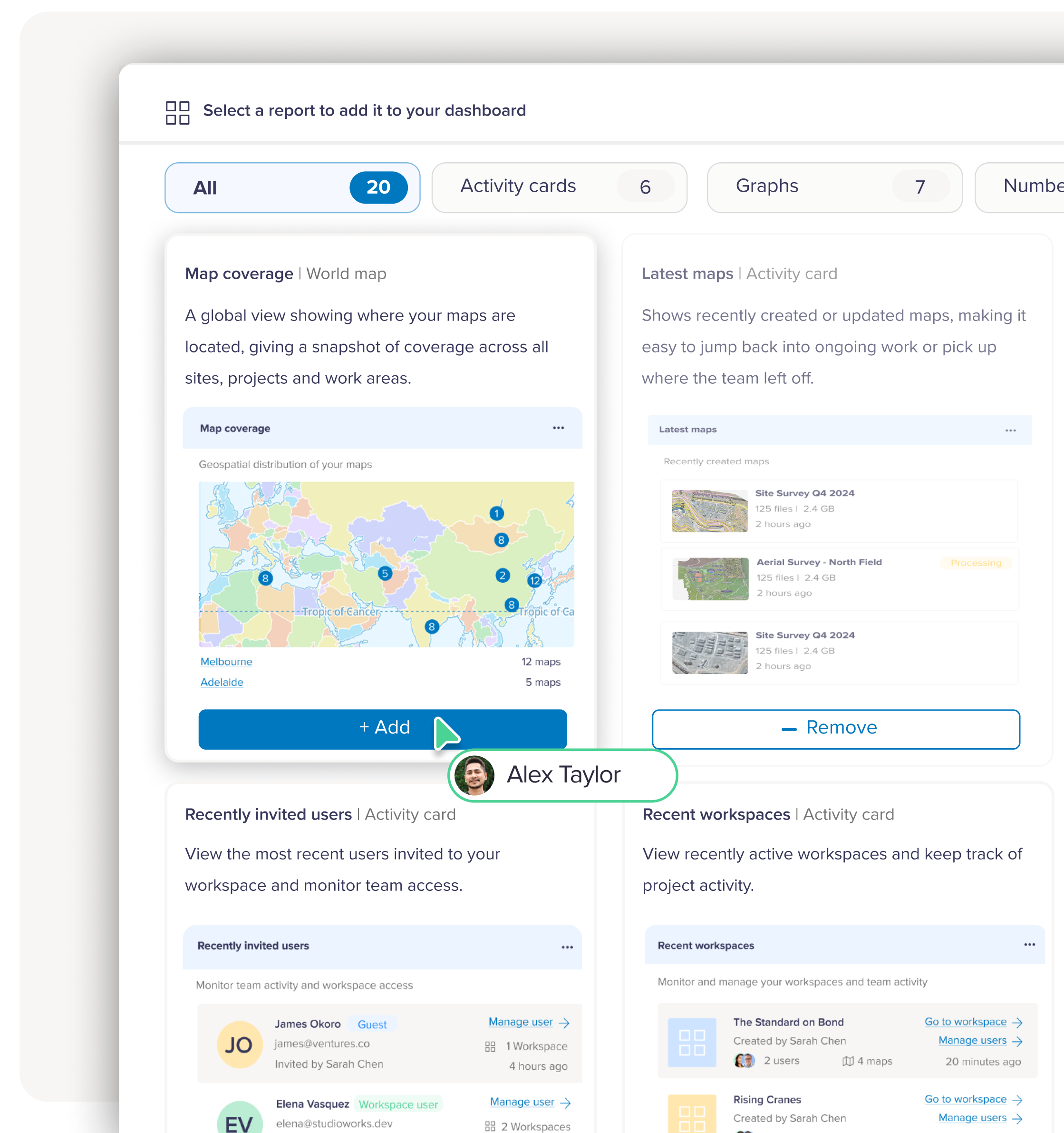
Under the hood, the dashboard is powered by a growing report and widget library. Each widget is designed to be quick to read and easy to understand — whether it’s a simple number, a trend graph, or an activity feed. And because you can pull these into your Default view, you’re essentially building your own dashboard over time.
Can’t find exactly what you need? You can even request new reports directly from within the platform.
Why this update matters
Most geospatial platforms focus on helping you process and visualize data. But as teams grow, the challenge shifts.
It becomes less about generating outputs and more about:
- Understanding what’s happening across projects
- Keeping track of activity and progress
- Making sure teams are aligned
- Turning data into decisions
This updated dashboard is designed to support that shift.
By separating different types of insight, making views customizable, and bringing collaboration into the picture, it helps teams move faster with more clarity.
___
The new dashboard isn’t something you need to “learn” in a traditional sense. It’s something you shape.
Once you’ve set up your Default view and spent a bit of time exploring the different tabs, it starts to reflect how you actually work, not the other way around.
And that’s where it becomes useful. Because when your workspace mirrors your workflow, everything else tends to move a little quicker.